class: center, middle, inverse, title-slide # Social Networks Worksheet ### Mathew Kiang ### 3/6/2017 --- class: center, middle # Download the code.red[*] ## [https://git.io/vy8vG](https://git.io/vy8vG) # Also download the data ## [https://git.io/vy8vO](https://git.io/vy8vO) --- class: center, middle # Question 1: Import a network, plot it, plot the degree distribution --- ## Import a network ```r ## Load the libraries (install if necessary) library(network) library(tidyverse) source('./code/network_practical.R') ## Load up data (make sure you have the right file path) mat1 <- read_csv('./data/unnamed_contact_network.csv', trim_ws = TRUE) ## Convert the matrix into a network net1 <- as.network(mat1, directed = FALSE) ``` --- ## Take a look at the data ```r print(mat1) ``` ``` ## # A tibble: 82 × 2 ## Names Contacts ## <int> <int> ## 1 1 31 ## 2 1 65 ## 3 2 61 ## 4 2 65 ## 5 3 10 ## 6 4 16 ## 7 5 16 ## 8 6 44 ## 9 7 44 ## 10 8 16 ## # ... with 72 more rows ``` --- ## Plot the network ```r ## Take a look at the network plot(net1, label = network.vertex.names(net1)) ``` 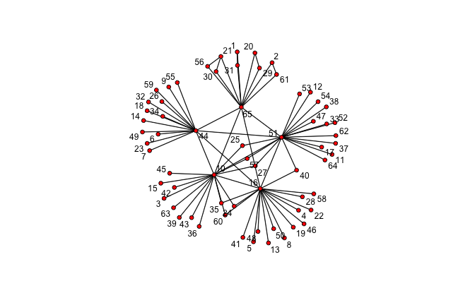<!-- --> --- ## Plot the degree distribution ```r deg <- NULL for(i in 1:network.size(net1)) { deg <- rbind(deg, length(get.neighborhood(net1, i))) } hist(deg) ``` 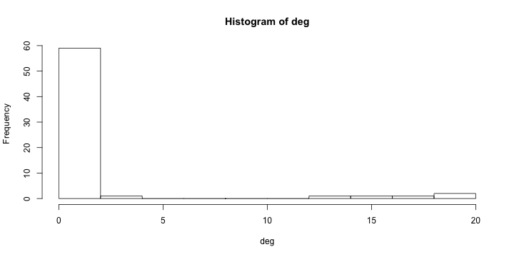<!-- --> --- class: center, middle # Visualizing randomness --- ## 500 simulations plotted ```r ## This just loops through n_sims times and makes that many lines/simulations ## NOTE: There's a difference between matplot and matlines n_sims <- 500 for (i in 1:n_sims) { sim <- networkPractical(net1, .2, .2, runTime = 50) ## If it is the first simulation, we need to create the plot canvas if (i == 1) { matplot(sim$timeSeries, lty = 1, type = "l", xlim = c(0, 50), ylim = c(0, network.size(net1)), col = alpha(1:3, .15)) ## If it is not the first one, we just draw on top of the existing canvas } else { matlines(sim$timeSeries, lty = 1, type = "l", col = alpha(1:3, .15)) } } ``` Play with the parameters and see how this affects the plots. --- ## 500 simulations plotted 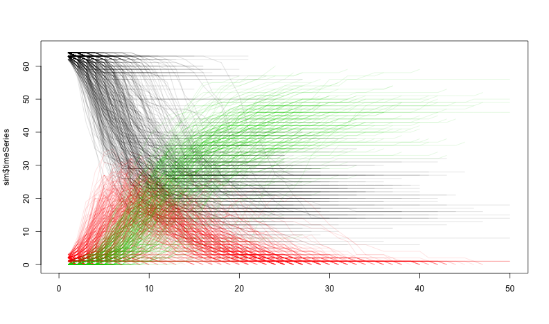<!-- --> --- class: center, middle # How does the starting infectious person change our model? --- ## Plot the network ```r vert_cols <- rep("black", network.size(net1)) vert_cols[c(7, 10)] <- c("green", "red") plot(net1, label = network.vertex.names(net1), vertex.col = vert_cols) ``` 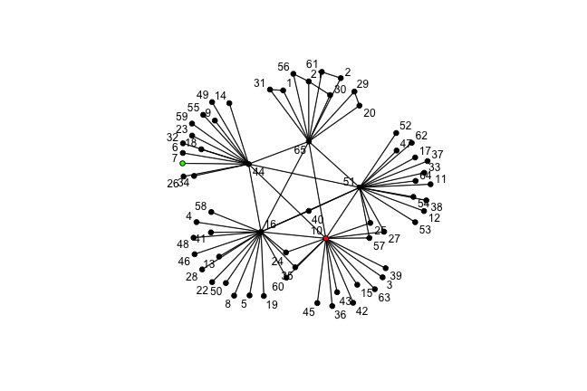<!-- --> Let's plot Node 7 (green) vs Node 10 (red). Note that Node 7 has only one edge, while Node 10 has 18. --- ## Node 7 (green) vs Node 10 (red) ```r n_sims <- 2000 for (i in 1:n_sims) { sim <- networkPractical(net1, .2, .2, runTime = 50, start_infected = 7) sim2 <- networkPractical(net1, .2, .2, runTime = 50, start_infected = 10) ## If it is the first simulation, we need to create the plot canvas if (i == 1) { matplot(sim$timeSeries[, 2], lty = 1, type = "l", xlim = c(0, 50), ylim = c(0, 40), col = alpha(3, .03)) matlines(sim2$timeSeries[, 2], lty = 1, type = "l", col = alpha(2, .03)) ## If it is not the first one, we just draw on top of the existing canvas } else { matlines(sim$timeSeries[, 2], lty = 1, type = "l", col = alpha(3, .03)) matlines(sim2$timeSeries[, 2], lty = 1, type = "l", col = alpha(2, .03)) } } ``` Modified the loop from before so that now we run two simulations -- one starting on Node 7 (green lines) and one starting on Node 10 (red lines). We plot only the infectious curve. --- ## Node 7 (green) vs Node 10 (red) 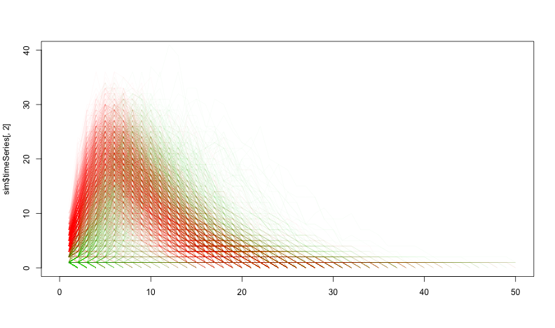<!-- --> What does the variation between the two colors tell you? What does this imply for network structure and infectious diseases? --- class: center, middle, inverse # That's it. ## Thanks